THAT CHRISTMAS
THE CINEMATOGRAPHY OF
by DAVE EDWARDZ
HEAD OF LAYOUT - THAT CHRISTMAS
INTRODUCTION
With That Christmas nominated for Best Picture at the Annies this coming weekend, I thought it might be interesting to discuss the approaches we took towards the cinematography of That Christmas via layout. There are a number of philosophies worth talking about that we incorporated into the film that helped to shape the story’s visual identity and I’m going to try to break them all down in the following article. I myself was privileged to work as Head of Layout on That Christmas, overseeing all of the layout in-house at Locksmith Animation and the cross-site collaboration with our team at Dneg. This made me ultimately responsible for all of the camera and top-level blocking of the film.
Where to begin then?
Firstly, as a film, That Christmas is slightly unconventional for an animation in the sense that it’s a multi-threaded story following several interwoven narratives rather than one single hero. This created a series of creative challenges that we needed to deal with when building the film’s visual structure as we needed to think about how we were going to tie all of the storylines together in a format that was not confusing, visually interesting, and dramatically satisfying for audiences. The film, of course, comes from the pen of Richard Curtis, who is well known for this type of narrative structure, as well as for creating Mr. Bean, Blackadder, and a number of other famous English properties including Four Weddings and a Funeral, Notting Hill, and Love Actually amongst others. In broad terms, his films are known as the British romantic-comedy house style and up until this point have been entirely live-action. Much of the interaction in these films take the form of sketch comedy, which is really a style of storytelling that comes from the lighthearted banter between the characters, and within this style, the camera staging is often restrained, performance-driven, and more of a platform for the dialogue rather than a showcase for the visuals. Our director, Simon Otto, wanted to draw on these qualities from Richard’s work as much as possible, but at the same time, also harness the power of the animation medium and push the visual potential of the film. This sort of meant that we needed to find a way to keep things grounded but also play up the visual design that an animation film requires.
ABOVE: Richard Curtis’s original book series was the initial inspiration for the film
A PICTURE BOOK STYLE
Firstly, we defined what we wanted our film to look like. Director Simon Otto wanted the film to have what we called a rich “picture book” style that depicted the world with a heightened sense of design that leant on the world of illustration. In this style, everything needed to be picturesque, and have a strong sense of visual purpose so that our shots should appear designed by an artist’s hand. To us, that meant being extra careful about all the details that went into each frame in order to create a strong sense of harmony between the characters and the world they were in. The details of the seaside environment became particularly important, and we took a lot of care to frame textural elements in the foreground, mid-ground, and background, emphasising the sense of the community, which was one of our core themes, whenever we framed anything. As a result, many of our shots could work as tableaus, and if done correctly, would evoke a strong sense of place regardless of whether we were shooting landscape or portrait shots.
ABOVE: The above 3 shots are good examples of our picture book style in the wide shots. Everything feels like it is framed with a purpose in a classic illustration methodology. There is strong attention to the details in the FG, MG and BG creating an excellent sense of depth, storytelling and texture.
These images are also an example of a key philosophy that we utilised: Simon Otto, the director, made a point of pushing us to try to include any elements of seaside, weather or Christmas paraphernalia in our shots. The last image has all three.
ABOVE: The above 3 shots show that the picture book style can still be applied even to shots framing the characters. Each of these images feels designed in the placement of the character to their environments and a lot of care was taken to find that balance. Often our character shots were more conservative or looser in framing than we would typically compose in modern films and this provided us opportunities at the edges of frame to include supporting storytelling from the surrounding environment.
GROUNDING OUR STYLE
However, as I previously mentioned, we had to do two things at once and our next decision was made to address how the camera language would actually behave within the boundaries of this picture book look. We chose to approach the shooting and lensing of our film in a grounded methodology that was reminiscent of Richard’s films so that we could make That Christmas feel like one of his sketch-comedies and put the emphasis on the performances. Though the events of the film take place in a fictional animation world, in most cases, we made every effort to treat the characters and locations as real, shooting them with real-world camera methodologies as opposed to treating it graphically or entirely 2D. The result of the latter option, I believe, would’ve been something quirky and funny, but perhaps lacking in the subjectivity that Richard’s previous films are known for. Furthermore, by lensing the film in a more grounded methodology, the hope was that our fictional world, regardless of stylisation, would feel more real, and that audiences would be swept up in both the believability of our characters’ storylines and the understated comedy of their lives.
ABOVE: This iconic frame from That Christmas echoes Richard’s previous work. Though the film is an animation, we often asked how would this be shot if it were a Richard Curtis film? Like Richard’s previous films, there is a sense of heightened romance or theatricality in scenes of every day Britishness.
ABOVE: Here are some of the close-ups from the same scene. There is a beauty in the simplicity and a naturalism in the camera placement.
ABOVE: We looked to Richard Curtis’s previous work for inspiration on the shooting methodology for our film. While the frames of our film were designed with a distinct picture book style in mind, camera placement, movement and the editing syntax were inspired by how his live-action films function. Often it was about simplicity and finding classic coverage, but even in the simplicity there are a lot of details.
A MOVING STORY
As I’ve already mentioned, one of the challenges of That Christmas was that the film intercuts between several different storylines, and it was important to find a way to seamlessly move from one narrative thread to another, keeping the energy of the film alive and not confusing the audience. To do this, we opted for a highly choreographed style that allowed us to flow from one scene to the next. This utilised a range of real-world camera techniques in the transitions that included sweeping camera movement, pans, tilts, focus pulls, wipes, etc. However, there wasn’t one set way we did this, but instead, we were always looking for an effective or interesting way to hand-off from character-to-character or one sequence to the next. Transitions that felt natural always worked best and were often motivated by character blocking rather than some clever filmic technique. Ideally, it should feel like there was a natural flow from one storyline to another in a slightly Altman-esque way. The combination of our picture book style, our grounded shooting methodology, and our multi-threaded choreography formed what we called our base style, and that is probably what many will recognise as the look and feel of the cinematography after watching the film.
Below are a handful of examples of some of our choreographed story transitions:
ABOVE: This is an example of a dynamic hand-off from one character moment to another. In this scene after the nativity play, Danny walks away despondent, catching sight first of Sam, then Mr. McNutt in the van. As he passes the vehicle, Bernie and the barn kids run past, climb into the van and take us to the next scene. Though the planning of this shot starts in story, we’ve pushed the idea in layout with a fluid steadicam-style shot that seamlessly picks up all the relevant details and allows us to hand-off gracefully to the new scene. Character blocking and camera movement are the heavy lifters.
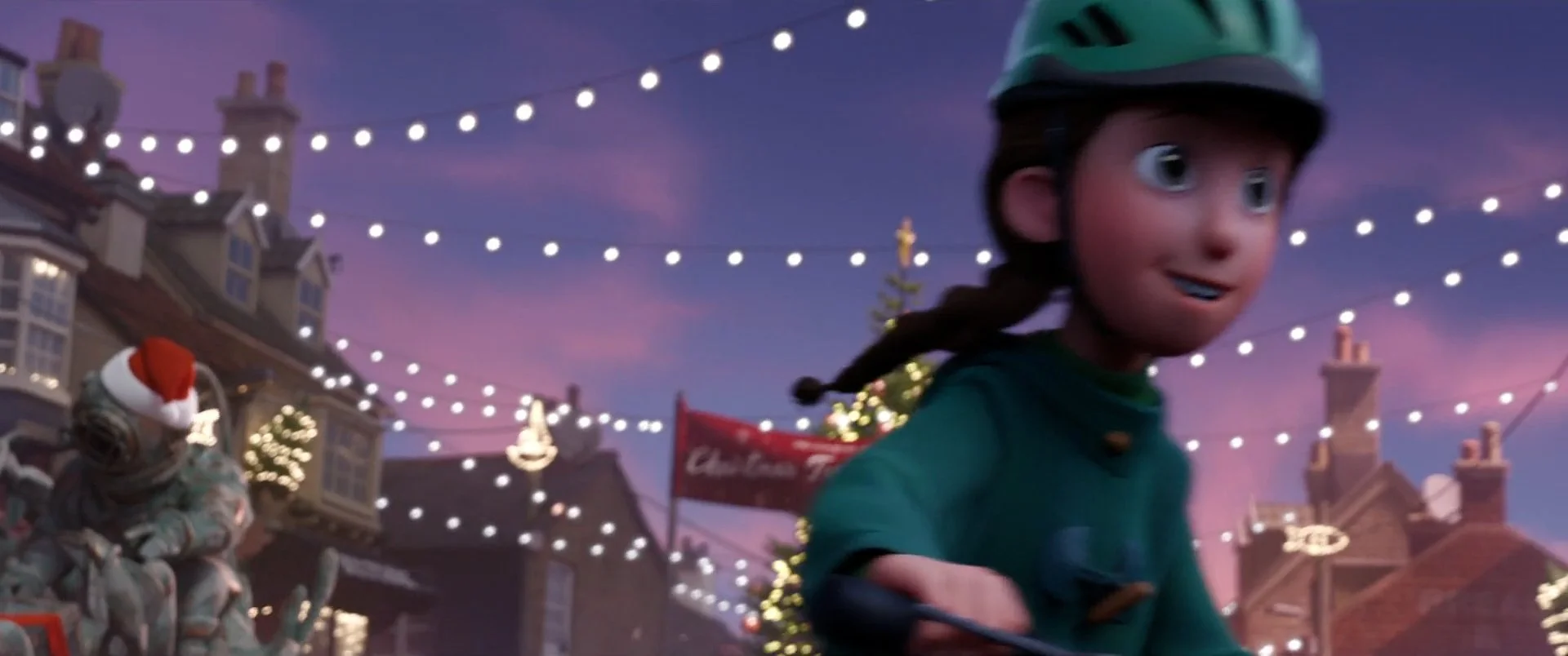
ABOVE: Again, here is an example a transitional scene between two storylines, this time between Danny and the twins. Here, after Danny has a moment thinking about Sam, he walks offscreen screen right, and as we cut, Sam and Charlie ride their bikes through frame the same direction, hooking up the action to take us to the new location. There is a flow of character and camera movement here that helps the cut to be seamless.
ABOVE: This is an example of one of our sweeping camera moves that takes us from one scene to the next. In the above moment, the camera pulls out and away from Sam’s story and becomes an objective shot travelling over the town before transitioning into a new scene.
There are many, many examples of these types of camera moves and hand-offs throughout the film. They may seem simple enough in isolation, but when the whole film is constructed using these techniques, the sum of the parts is an incredibly graceful style of storytelling that allows us to seamlessly move from one storyline to the next without creating a lull in the audience experience.
NARRATIVE IDENTITY
In addition to the base visual style of That Christmas, we also explored one more concept in our cinematography which helped to enrich the visuals and that is the idea of Narrative Identity. What this means is that within the boundaries of our base style, each of the storylines represented a different thematic idea and then in turn would have a slightly different look, shooting methodology, or visual identity assigned to it. Some of the other departments, such as Production Design, had already been exploring this idea in both their shape and colour language, but we thought it was such a good idea that we too could also expand upon it through our cinematography and create a more unified film. In creating these visual differences, the hope was that they would dramatise each of the storylines, push the themes of the film, and then create stronger visual interest throughout. They also help to anchor the viewer as it’s important too that the audience should always instinctively know what storyline they’re in, especially when we’re cutting around so much.
The big ideas revolved around different meanings of Christmas, and at the top level, the divisions could be seen as the following:
Sam and Charlie, the two twins, have a happy family home and represent the idea of a Perfect Christmas. Danny, the outsider who has just moved to Wellington on Sea with his single mother, represents the idea of No Christmas. Bernadette and the Barn Kids, who are left without their parents and have to reinvent Christmas, represent the idea of a New Christmas.
So with these ideas in mind, what this meant specifically in the cinematography for each narrative thread was the following:
Sam and Charlie had a free-flowing cinematic style that evoked the most Christmassy of Hallmark films. We called this style the chocolate-box, referencing delicious chocolate commercials where everything looks perfect, with rich, saturated colours, shot with beautiful, soft-focus lenses. This reflected the twin’s experience of Christmas. The shooting methodologies for this storyline meant that we could emulate any big-budget techniques or equipment, including dollies, cranes, steadicams, or whatever was needed to create a Perfect Christmas.
ABOVE: Within the free-flowing camera work that we used for a “Perfect Christmas,” Sam and Charlie were often framed together as a unit. A lot of our coverage was then designed to interactively hand-off from one character to the next, even within their own storyline.
Danny’s style was much simpler, evoking the sparsity of British social-realist films. Overall, his style was a little more objective than the others, being shot from a distance. This is because Danny feels a little out of place, and the style of cinematography was trying to reflect that. Whereas Sam and Charlie’s style used all of the camera equipment available, Danny’s style used a minimalistic approach; often just a camera with a long lens on a tripod which was placed across the road or in another room so that there was a sense of isolation in his story. The empty space was emphasised as this was No Christmas.
Bernadette and the barn kids are a little rebellious by nature, and therefore we chose to shoot them with a handheld style that was more chaotic in movement and composition. This produced a slight edge to the way their scenes felt but also allowed the camera to be more reactive and energetic in how it responded to them. This methodology created a greater sense of reality in their scenes and also an increased intimacy because the camera is more reactive to their performances — the audience is placed right in their space.
ABOVE: Bernadette’s storyline is interwoven with that of the barn kids. Unlike Danny or the twins, there is a lot of ensemble staging and we had to work hard to find clear ways to stage the kids or dynamic ways to introduce and hand-off to each character. We often tried to stage in depth and use character blocking to help us naturally guide the eye. Handheld camera worked well with this.
Additionally, the ensemble staging would often provide a sense of natural chaos to the images that complemented Bernadette’s story.
It may seem that all of these stylistic changes could be too much as we cut between storylines, however, these stylistic flourishes were not really designed to overpower our overall base style but instead were created to work as a flavour that would allow us to change the tone whenever we shifted narrative thread. They’re not super noticeable, but they’re there and they help to enhance each storyline.
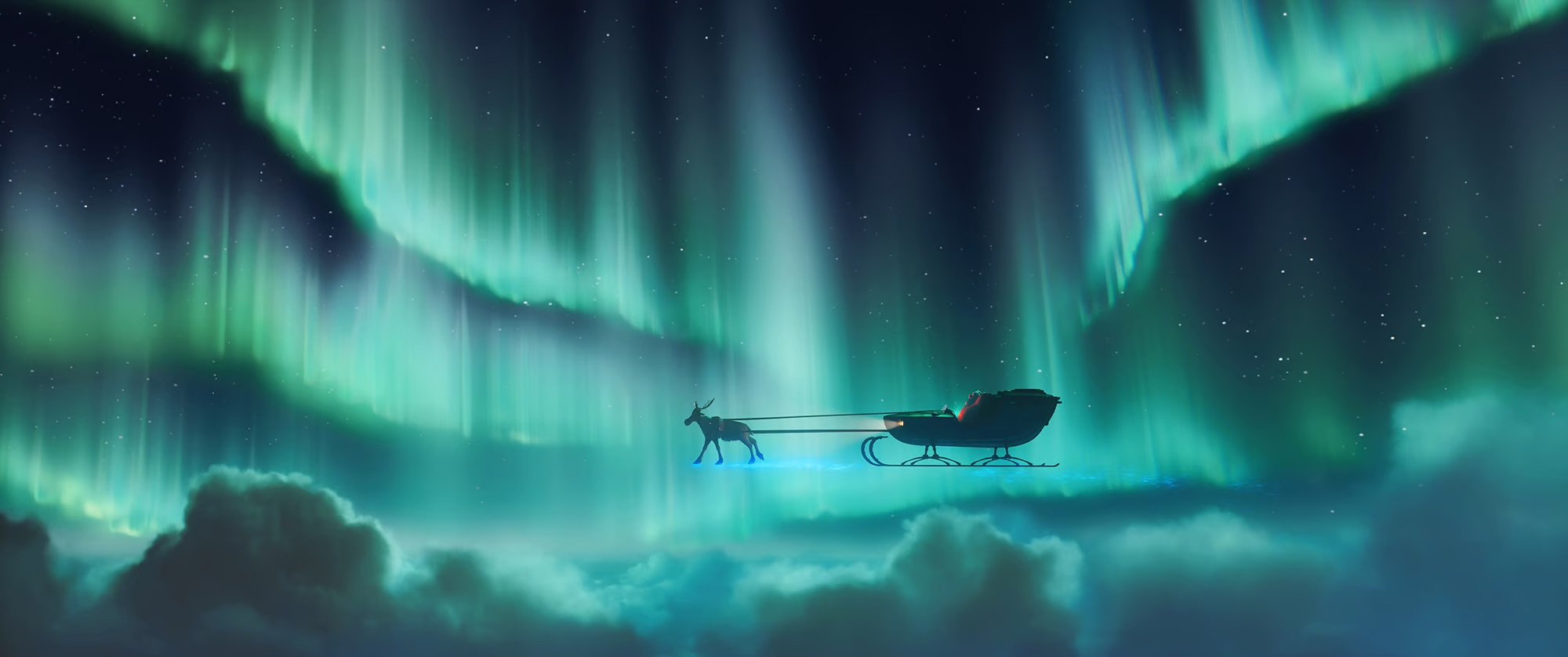
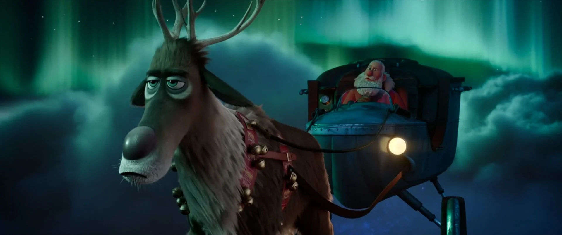
In addition to our three main storylines above, there were also some other characters with their own visual identities that helped to elevate the tone of the film. The obvious one is Santa Claus, who acts as the film’s narrator. When you look at the three main storylines, though charming, they’re actually quite small domestic narratives, and Santa’s arrival helps to inject a level of heightened action and excitement into the whole film. His storyline elevates all of the stories into a more broader theatrical event and becomes the coat hanger that the other stories hang upon. Within Santa’s scenes then, we therefore pushed the theatricality as far as we could to heighten the visual excitement of his arrival. His sequences are designed as an action-comedy, and therefore we used every trick you could think of to try and make his scenes as exciting or funny as possible before we quietened the tone for the major narrative threads.
ABOVE: Santa’s scenes provide a dynamic counterpoint to the charming but more domestic scenes. We took special care to make them as exciting as possible in order to lift the energy of the film.
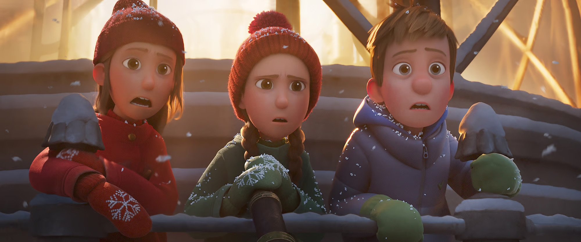
Lastly, I would just like to point out that while this was our creative approach for shooting the film, being a multi-threaded story, there were many narrative arcs within the film itself, and some of these styles morphed as each of the characters went on their own distinct journeys. As a result, there were many scene-by-scene subtleties as the characters or their relationships changed. For instance, Danny becomes a bit of a hero throughout the film, and his style of cinematography morphed from something a little distant to something that felt far more engaged and heroic by the end of the film. By the climax of the film in the blizzard, the story becomes a coming together of all the narrative threads as the town searches for Evie, and what we really ended up with was a large-scale sweeping style of cinematography that is a blend of everything we’ve seen before.
ABOVE: In multi-protagonist films there is often an external antagonist that ties the storylines together, and in our film it was the blizzard. Towards the end of the film, there is a sense of all the stories coming together against the crazy storm and our stylistic approaches fused to create one sweeping style of cinematography that allowed us to build to a cllimax.
ABOVE: Danny becomes a bit of hero by the end of the film and his shot language reflects that.
A HEARTWARMING SEASIDE CHRISTMAS
So there you have it. That was our approach to how we shot That Christmas, the charming Christmas film you’ve seen on Netflix. Within our cinematography, we tried to create a quaint picture book feel that celebrated what it feels like to experience Christmas in the small seaside town of Wellington-On-Sea. The shooting style was designed to be highly choreographed, blending seamlessly between the multiple storylines and finding visual difference by leaning into the narrative identity of each story thread. Though I’m very proud of the work that my team did, a lot of these ideas don’t exist in a vacuum, and we’re really standing on the shoulders of some other great creative minds on the project. The cinematography in layout was really a marriage between story, production design, animation, and editorial, amongst others, and our work would not be anything without their amazing work. It was a labour of love for everyone involved and I’m deeply thankful for everyone’s contribution. I hope that you enjoyed the film and that you’ve gotten something out of the article.
DAVE EDWARDZ
HEAD OF LAYOUT - THAT CHRISTMAS
ABOVE: There was a happy-ever-after for our story. True to our style, the final frame contains classic elements of Britishness, Christmas, the weather, seaside traditions and community which were all essential ingredients to telling our story.


